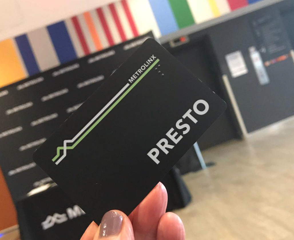
The Presto card is a contactless smart card automated fare collection system used on participating public transit systems in Ontario, Canada, specifically in Greater Toronto, Hamilton, and Ottawa.
UI/UX Design
Heuristic evaluations play a crucial role in improving the usability of products or systems by identifying design issues early, providing an objective assessment, and facilitating an iterative design process. By leveraging these evaluations, organizations can create more user-friendly and effective solutions, leading to enhanced user satisfaction and success in the market.
THE CHALLENGE
Our project involves conducting a heuristic evaluation to assess the usability of the Presto application. Through a design challenge, we evaluated the interface based on established usability principles, with the potential for future collaboration based on the success of the evaluation. Phase two of the project focused on implementing recommended usability improvements by redesigning screens within a specific product flow. This project presents an opportunity to enhance the user experience, address usability issues, and contribute to the ongoing development of the digital product.
OUR APPROACH
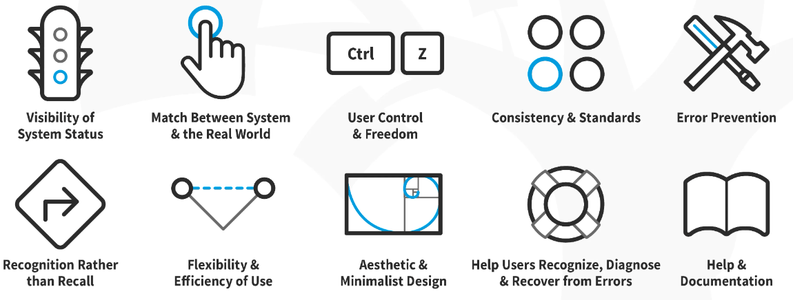
In this challenge, Nielsen Norman Groups' ten heuristics for user-interface design are used for evaluating the usability of an existing Presto App. These heuristics offer a well-established and comprehensive framework covering various usability aspects. They provide clear guidelines and a user-centred focus, ensuring a systematic and practical evaluation process. Nielsen's heuristics are widely recognized and accepted in the industry, facilitating effective communication and collaboration. By utilizing Nielsen's heuristics, this evaluation aims to identify usability issues and provide actionable recommendations for enhancing the digital product's user experience.
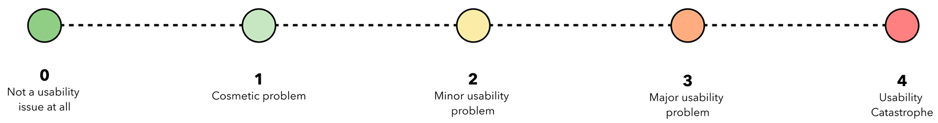
SEVERITY RATING SCALE
The severity scale guides usability experts to prioritize and communicate the urgency of addressing identified issues. By assigning severity ratings to usability problems, it helps stakeholders and development teams understand the potential impact on the user experience and make informed decisions regarding allocating resources and prioritizing fixes.
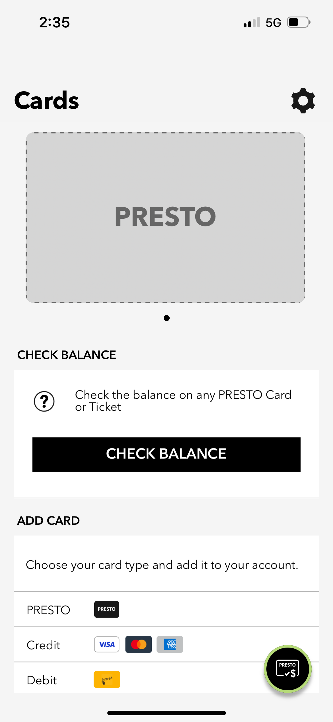
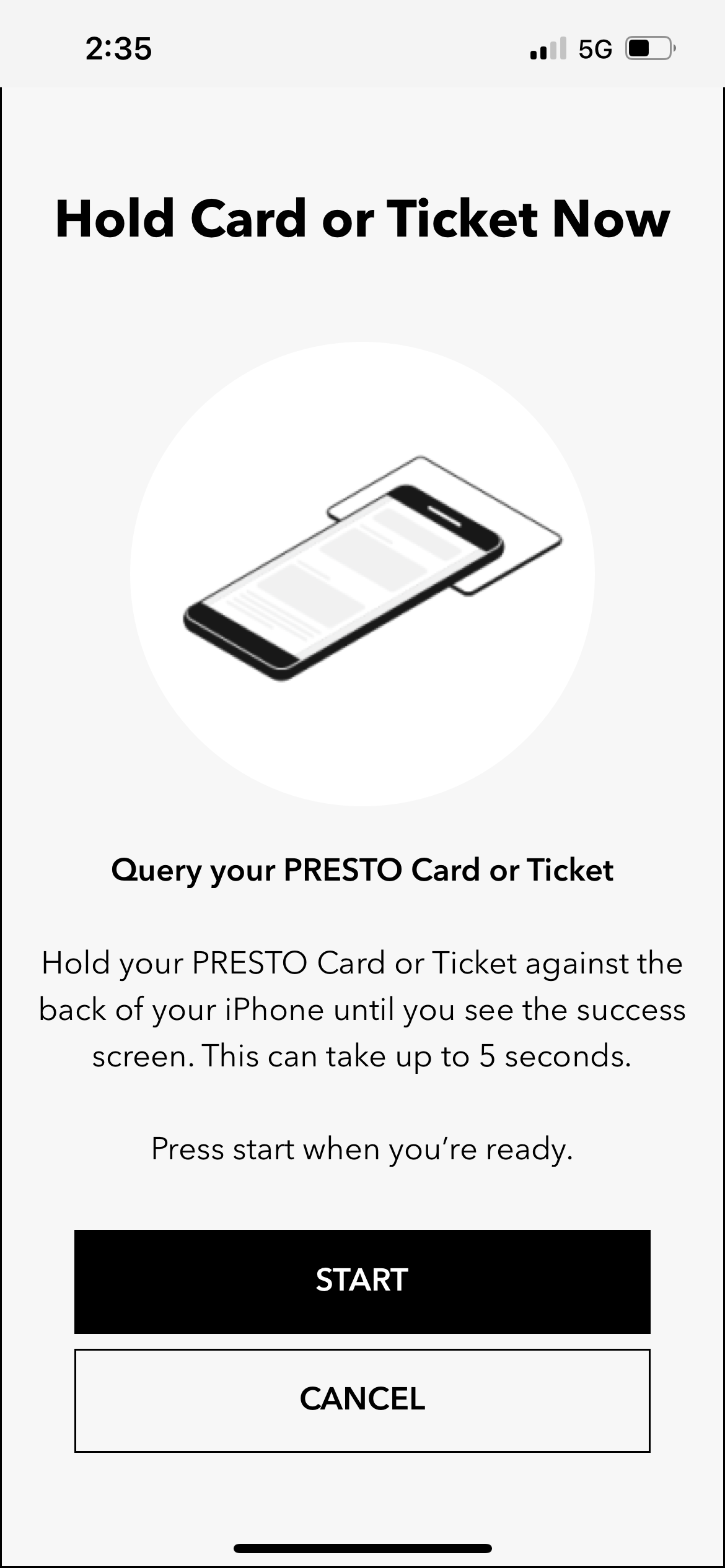
SCOPE OF EVALUATION
This evaluation report covers the following parts of the Pesto mobile app on iOS only:
EVALUATION
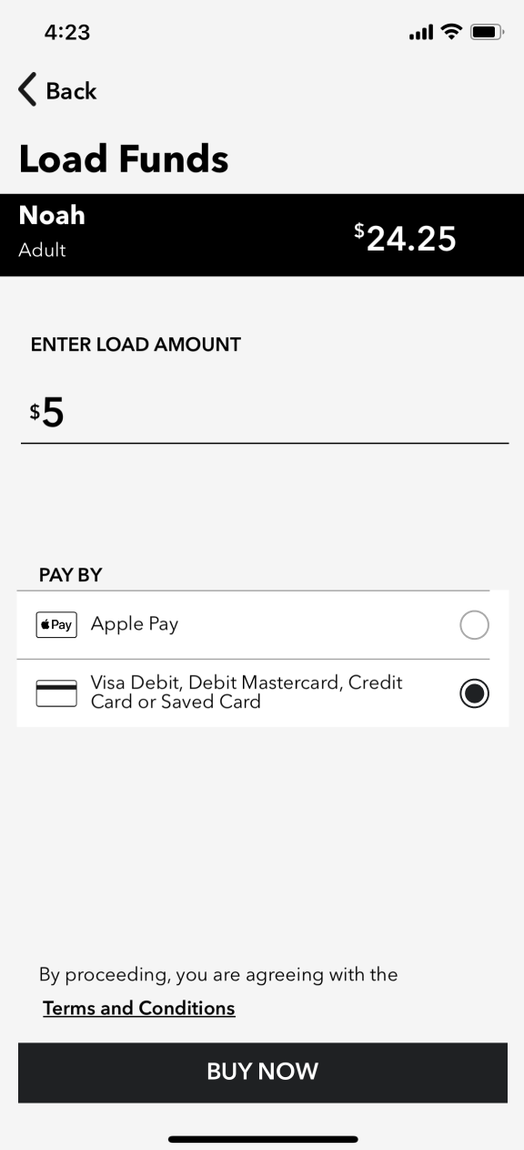
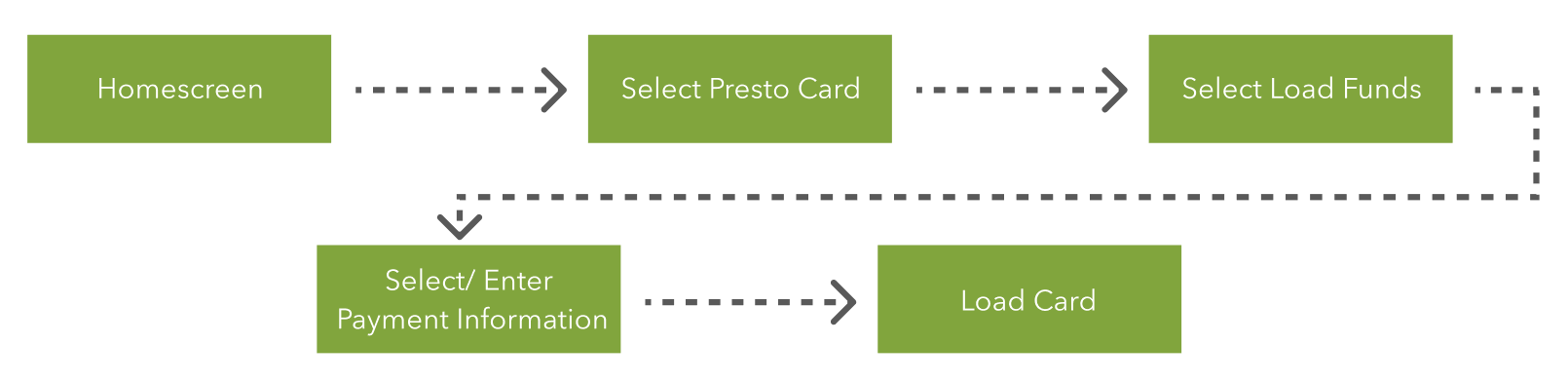
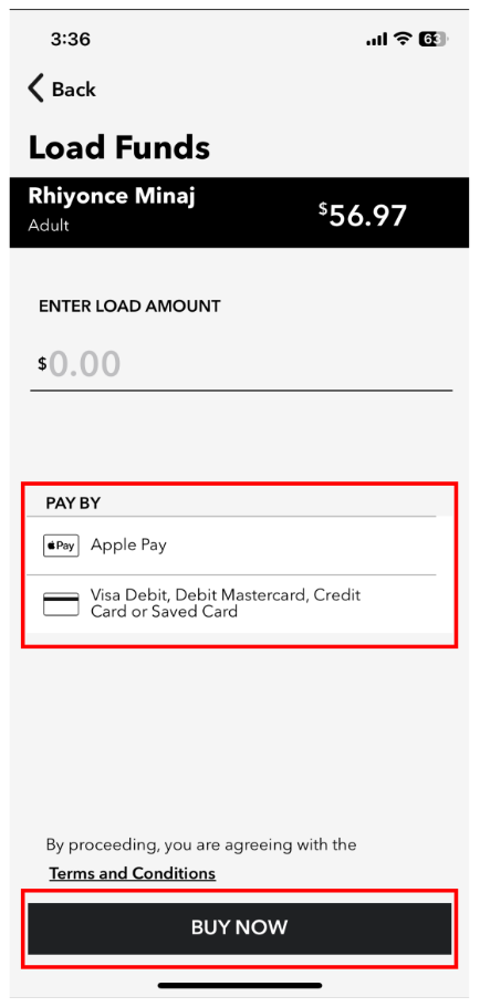
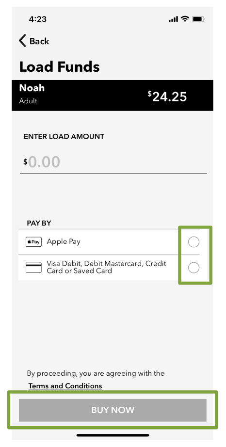
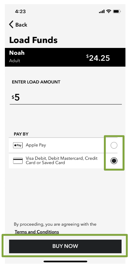
Flow Stage: Select Load Amount
Heuristic Evaluation: 5 - Error Prevention
Usability Issue
- The importance of selecting a payment method can be easily overlooked due to the lack of highlighting or visual cues once either of the "pay by" options is chosen
- “Buy Now” button is in an active state despite missing information
Severity Rating: 2/4
Solutions
- Empty buttons beside payment methods
- Leave the “Buy Now” button greyed out until the user inputs all necessary information
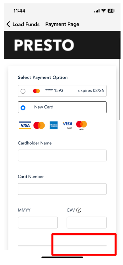
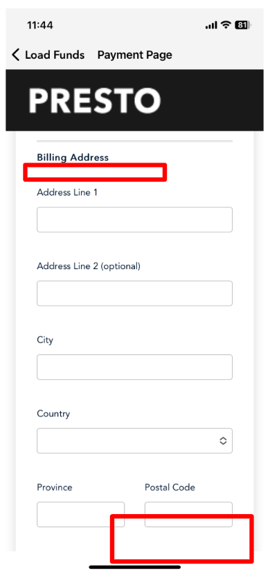
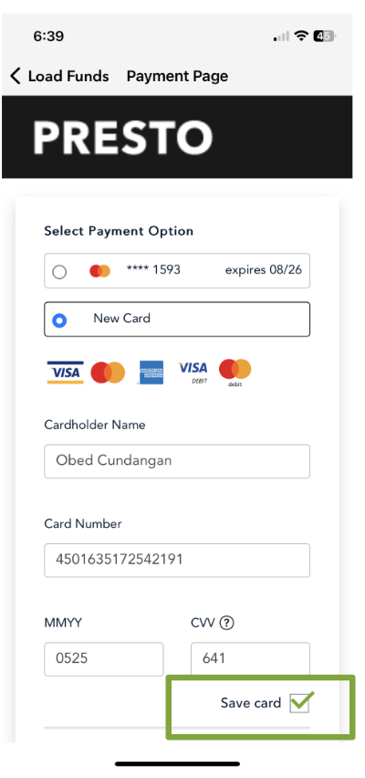
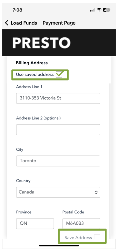
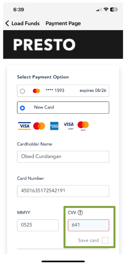
Flow Stage: Entering Payment Information
Heuristic Evaluation: 6 - Recognition Rather than Recall
Usability Issue
- No option to use previously saved address information
- No option to save new card or address information for future use
Severity Rating: 2/4
Solutions
- Provide an option to use already saved information
- Provide options to save new payment/address information for future use
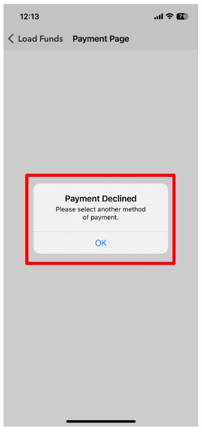
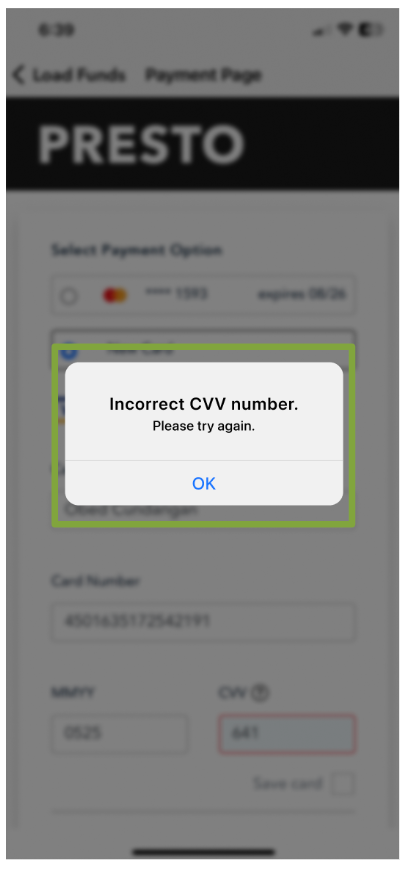
Flow Stage: Entering Payment Information
Heuristic Violation: 9 - Help Users Recognize, Diagnose, and Recover from Errors
Usability Issue
- The error message provided by the application lacks clarity as it fails to identify the specific issue at hand, providing only a vague notification of an unspecified problem.
- Upon clicking "Okay," the user is redirected back to the initial stage of the flow, necessitating the laborious task of re-entering all the required information once more.
Severity Rating: 3/4
Solutions
- Specify error for clarity
- Stay on the payments page after the error is identified
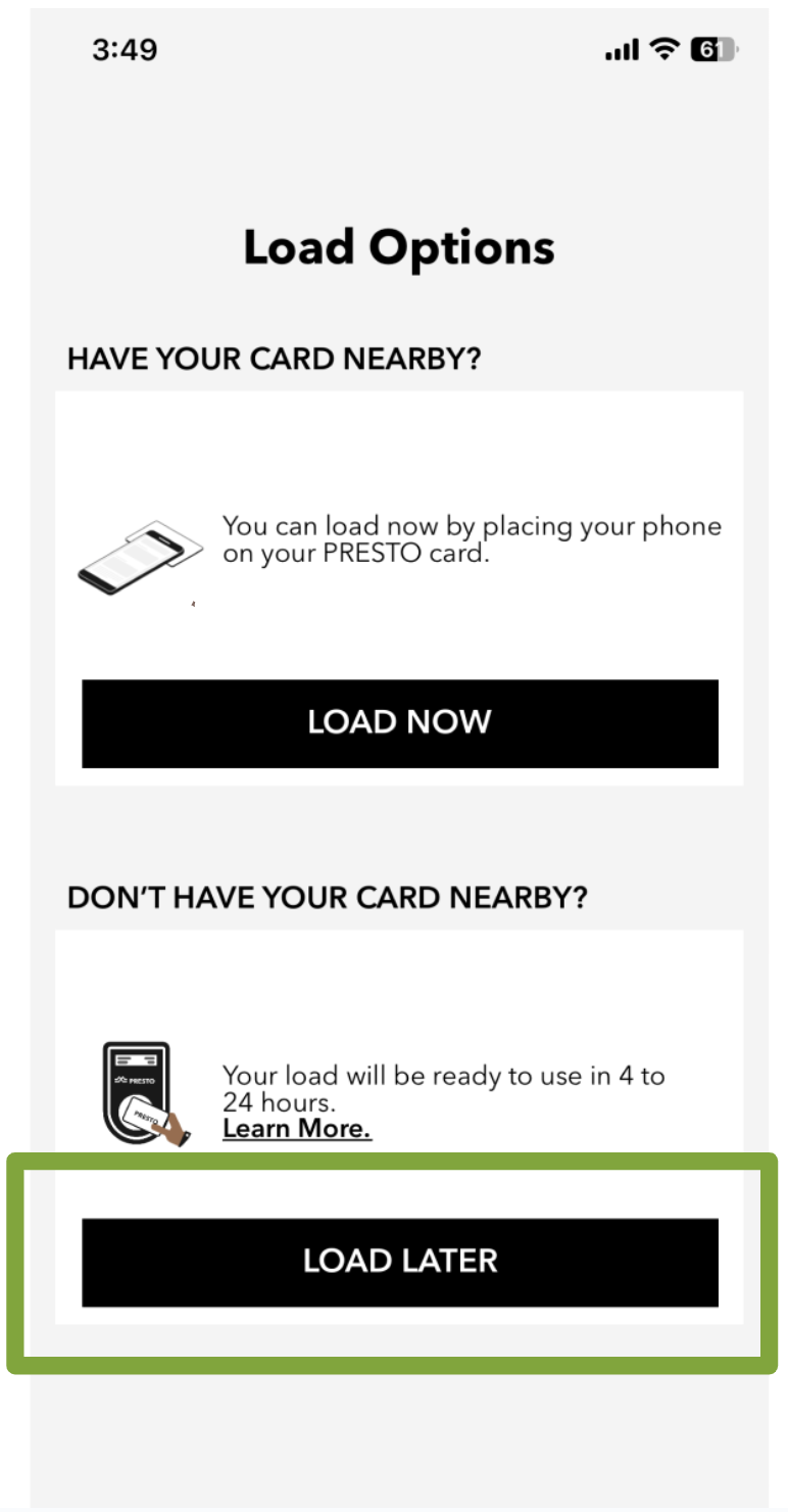
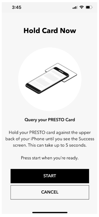
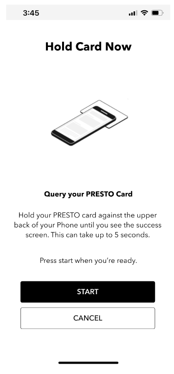
Flow Stage: Loading Card
Heuristic Violation: 3 - User Control and Freedom
Usability Issue
- After choosing the "load later" option, there is a notable absence of a prompt or confirmation to validate the decision made.
-There is a lack of provisions or mechanisms to rectify or recover from any errors or mistakes made within the system.
Severity Rating: 3/4
Solutions
- Provide a confirmation modal to ensure the user knows what option they’ve selected


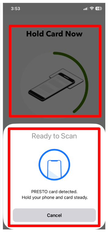
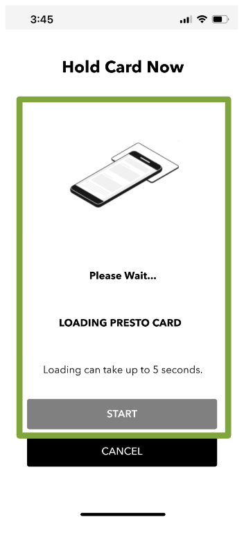
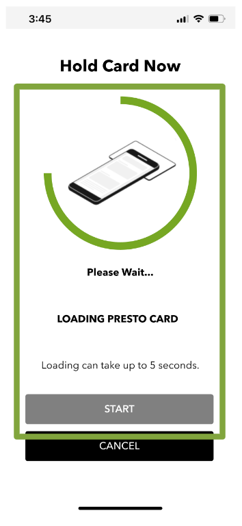
Flow Stage: Loading Card
Heuristic Violation: 1 - Visibility of System Status
Usability Issue
- The system not only fails to offer appropriate feedback regarding the processing of the card but also lacks sufficient visual guidance to facilitate the completion of the task effectively
Severity Rating: 3/4
Solutions
- Provide more visual guides for the user
- Create a more robust and justified hierarchy of information
How will we measure success?
To measure the success of our suggestions, I would consider these three factors: